Macro Chart Pack
After a historically volatile month, we look at the charts that tell us where the market sits.
If a picture is worth a thousand words, a well-cut financial chart (dark background, crisp lines, and a hint of edge) sketches ten thousand.
Below, we walk through some of the charts commanding our attention, with a focus on volatility, correlation structures, and emergent macro themes.
Volatility
If the comparison between implied and realised volatility is anything to go by, we could be looking to settle down regarding wild intraday swings on SPX. The blended 60-day realised volatility (orange) is now comfortably above the comparative implied volatility (white) for the coming 30 days, suggesting (amongst other things) that option traders are pricing in lower expectations or sharp moves.
An alternative way of looking at this is that the market is now better prepared for knee-jerk moves on headlines, so we’d need to see something more ground-breaking or serious to get the same % move that we saw a month back.
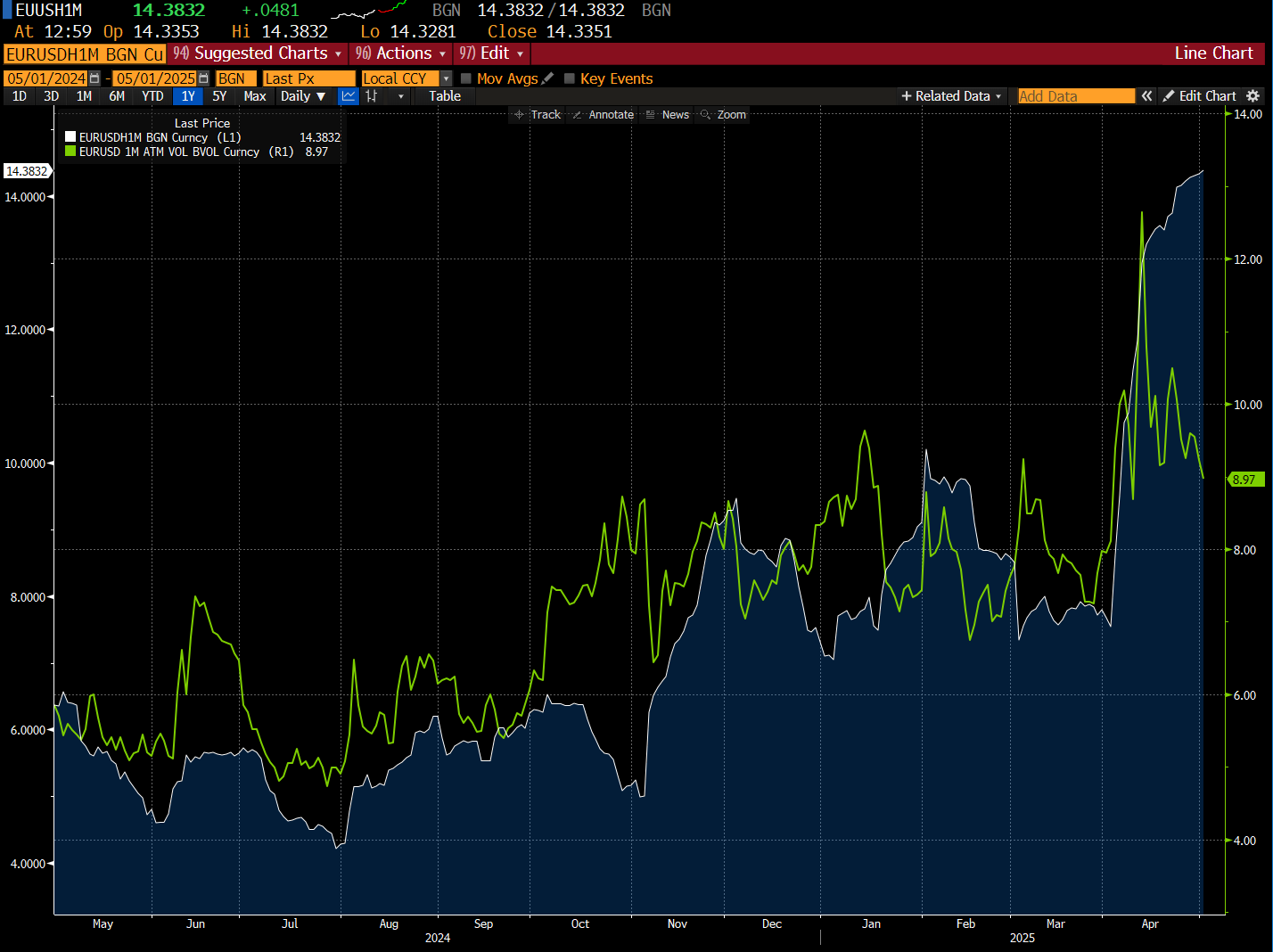
The same theme carries over when we turn to the currency markets. EUR/USD one month at-the-money (ATM) volatility (green) is now back below the one month historical measure.
The size of the move lower we’ve seen with the greenback has been sharp, and although we don’t think the move has finished in the medium-term, the pace of any further depreciation likely comes in a much more orderly fashion, as we discuss next.
April saw the DXY post its worst monthly percentage loss since 2022, in a volatile move that compounded the drawdown that started in January. In fact, it was the fourth straight month of decline for the greenback.
When we tally up the multitude of factors that have contributed to this move, ranging from shifting monetary policy outlook to domestic growth concerns, it’s hard to make a case for a sharp bounce back in May (3%+). However, when we have seen a monthly decline in excess of 4%, the following month hasn’t seen a subsequent loss in excess of 3% since the 1990s.
Correlations
The correlation between the U.S. 10-year yield and SPX has picked up over the past month to positive territory, although this is different from the previously positive stint from Q4 last year. Back then, particularly post-presidential election, we saw both yields and equity markets head higher, fuelled by a feel-good vibe for stocks alongside inflationary concerns from the bond markets.
The pick up over the past month has come with stocks whipsawing both higher and lower, with Treasury yields having similar erratic price action, but ultimately exhibiting a modest positive correlation.
It should be noted that even though the traditional correlation of being inversely linked doesn’t currently apply, we’re only seeing it at +0.17. This is hardly a strong connection, but it is worth noting that we’re not currently at the stage of equities rising / bond yields falling.
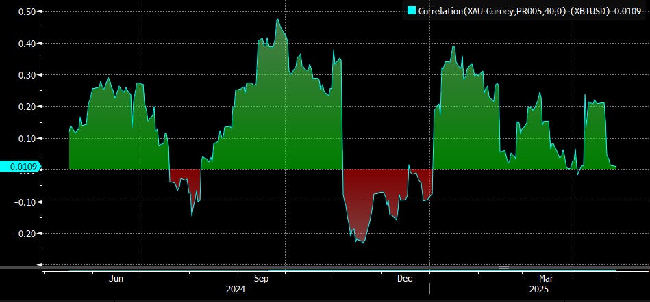
A lot has been written about gold in recent weeks, as well as the rise of “digital gold”…Bitcoin. Even though the historical correlation between the assets has been broadly positive, we don’t think this will necessarily remain the same over the coming month.
Given the rush to own gold as a safe-haven play, any unwinding of this on boosted risk sentiment likely sees BTC trade higher, with gold moving lower. Granted, a falling USD will benefit both assets, but the positive correlation only likely sticks around if we get inflationary concerns or another trade-related shock that sees gold rally and BTC tread water.
Now let’s turn to silver, which we recently wrote about as offering a higher beta way of expressing equity upside from here than other precious metals such as gold. Given the blow-out in the gold/silver ratio in recent weeks, being long silver either outright or via a spread trade could be a nice way of playing a catch-up move, aside from just the indirect equity correlation.
Keep reading with a 7-day free trial
Subscribe to AP Research to keep reading this post and get 7 days of free access to the full post archives.


